“Some ideas don’t need architecture. They need to ship before the feeling fades.”

I don’t vibe code.
Not for real projects, anyway. Production apps, client work, anything with actual users — I want a reviewed diff, a real architecture, a developer who understands what’s actually running. Prompt-and-ship coding makes me nervous the second stakes go up.
Then I found saloon.wtf. And it broke my own rule in the best way.
What Is saloon.wtf, Actually? 💈
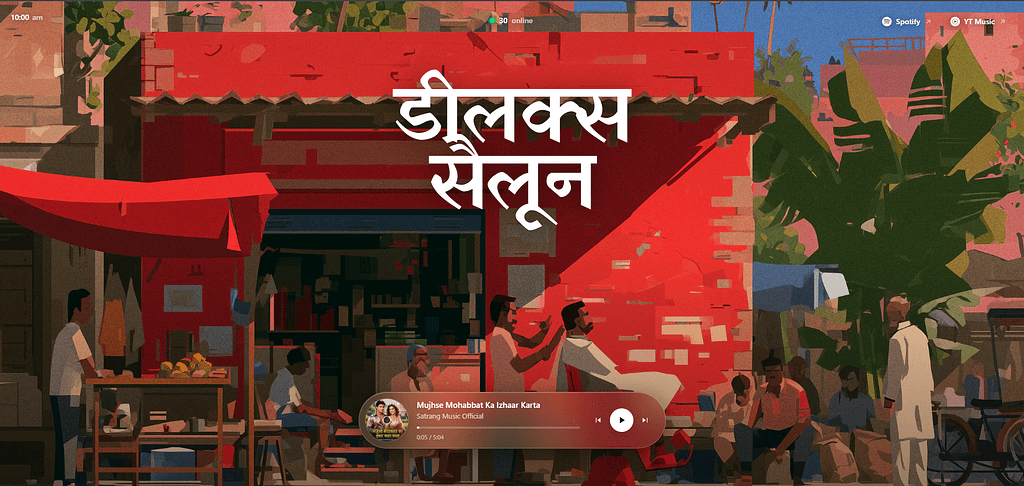
It’s called Deluxe Saloon. One job: stream the 90s Bollywood songs that play at Indian barber shops.
That’s the entire pitch. No account. No feed. No algorithm.
One song plays. The artwork fills the screen. A quiet little “X online” counter tells you someone else, somewhere, is listening to the exact same track right now.
You already know the sound if you grew up around one of those shops. Nobody curated that playlist. Nobody could name half the songs. It was just there, every single time.
Why I Don’t Vibe Code (Normally) ⚠️
Vibe coding falls apart the moment complexity shows up. Edge cases. Scale. Security. Business logic that has to stay correct under pressure.
Those are exactly the things fast, low-review, AI-assisted building tends to miss — because nobody’s slowing down to ask the hard questions.
That’s fine for a weekend idea. That’s not fine for anything real users depend on.
But This One’s Different 🎶
saloon.wtf isn’t trying to be a platform. It’s not onboarding a million users. It’s not touching payment data. It’s one sharp idea, shipped fast, while the feeling was still fresh.
Small surface area. Low blast radius. A concept clear enough that the build barely needed deliberation.
That’s the sweet spot. Vibe coding earns its keep when the value is in shipping the feeling before it goes stale in your head — not in surviving five years of scale.
The UI Doesn’t Try Too Hard — And That’s the Whole Point ✂️
A few things stood out immediately:
- One song, full focus. No scrollable list stealing your attention. Just the current track, filling the frame.
- The live listener count. Small. Almost throwaway. But it quietly tells you this weirdly specific memory is shared.
- Zero onboarding. You land, and it’s already playing. No modal standing between you and the nostalgia you came for.
- Restraint everywhere else. No settings panel. No extra nav. The interface trusts the content instead of compensating with features.
Simple doesn’t mean empty. Every remaining element here is earning its place — and that’s the actual design skill, not the minimalism itself.
Nostalgia Isn’t a Feature. It’s the Product. 🪞
Here’s the trick most builders miss: reviving nostalgia is a UI decision, not a feature list.
You don’t remember a barber shop playlist as song titles. You remember an image. A feeling. A specific track through a specific bad speaker.
Putting the album art front and center instead of burying it under UI chrome respects that. The typography stays quiet. The palette doesn’t compete. Nothing here is trying to “brand” the experience beyond the concept itself.
The richness isn’t visual complexity. It’s an emotional payload that was already strong before a single line of code got written — and a UI smart enough to just get out of its way.
Where I Land On Vibe Coding Now 🧭
I still wouldn’t vibe code a fintech app. Or healthcare. Or anything holding real user data. That instinct hasn’t moved an inch.
But saloon.wtf sharpened the boundary instead of blurring it.
Vibe coding works when the idea is small, personal, and time-sensitive. When the whole job is shipping a feeling before it fades — not surviving a five-year roadmap.
Knowing when not to slow down is still discipline. It’s just a different kind than the one I usually write about.
If you had a barber shop like the one this was clearly built for — go listen. You’ll know in five seconds whether it was made for you.
Tags: Vibe Coding, UI Design, Web Design, Nostalgia, Product Design, Indie Projects